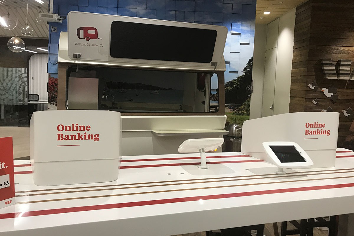
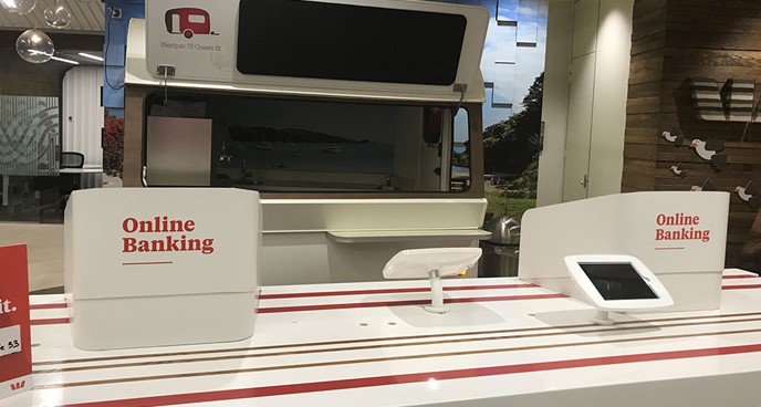
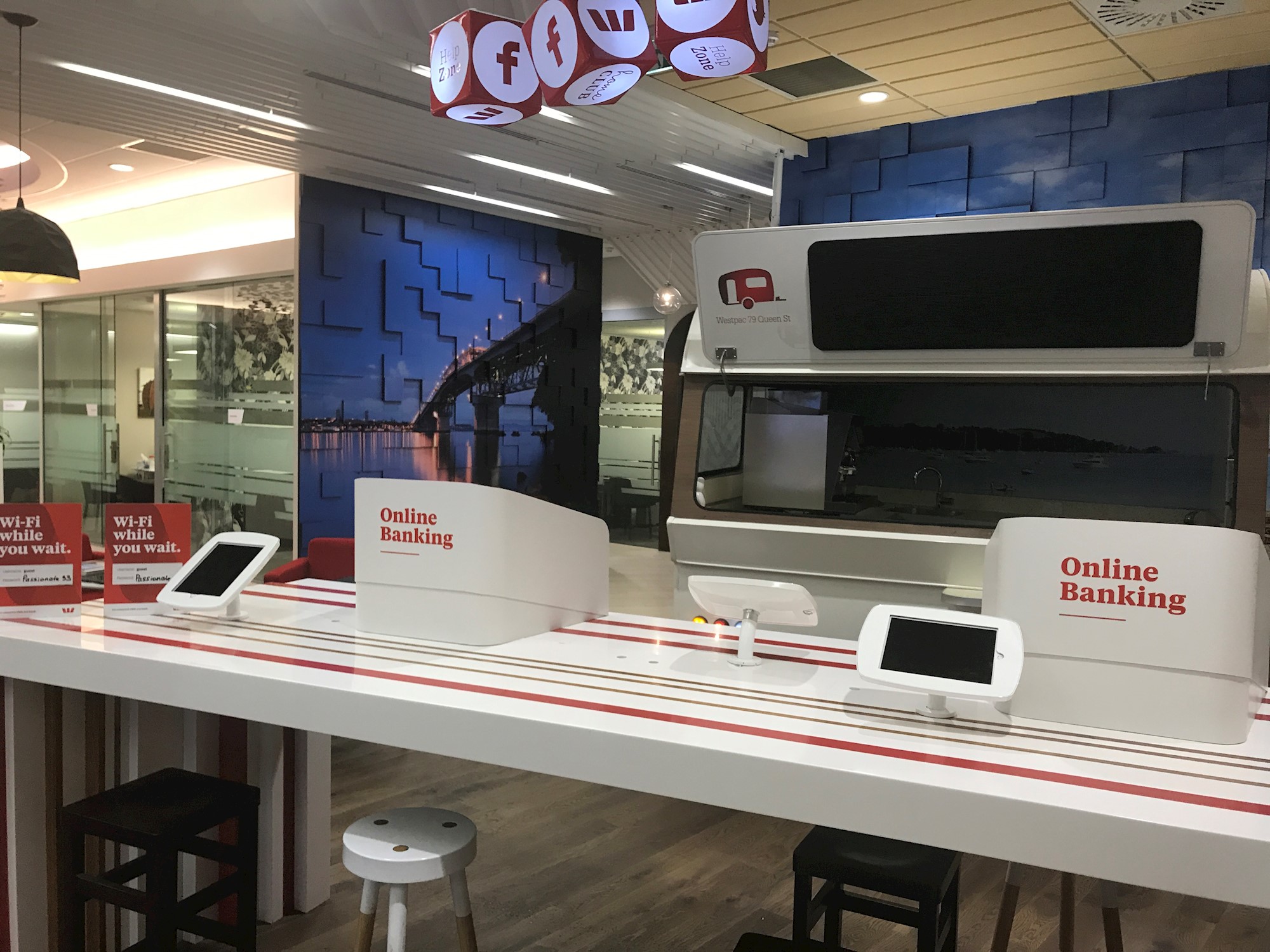
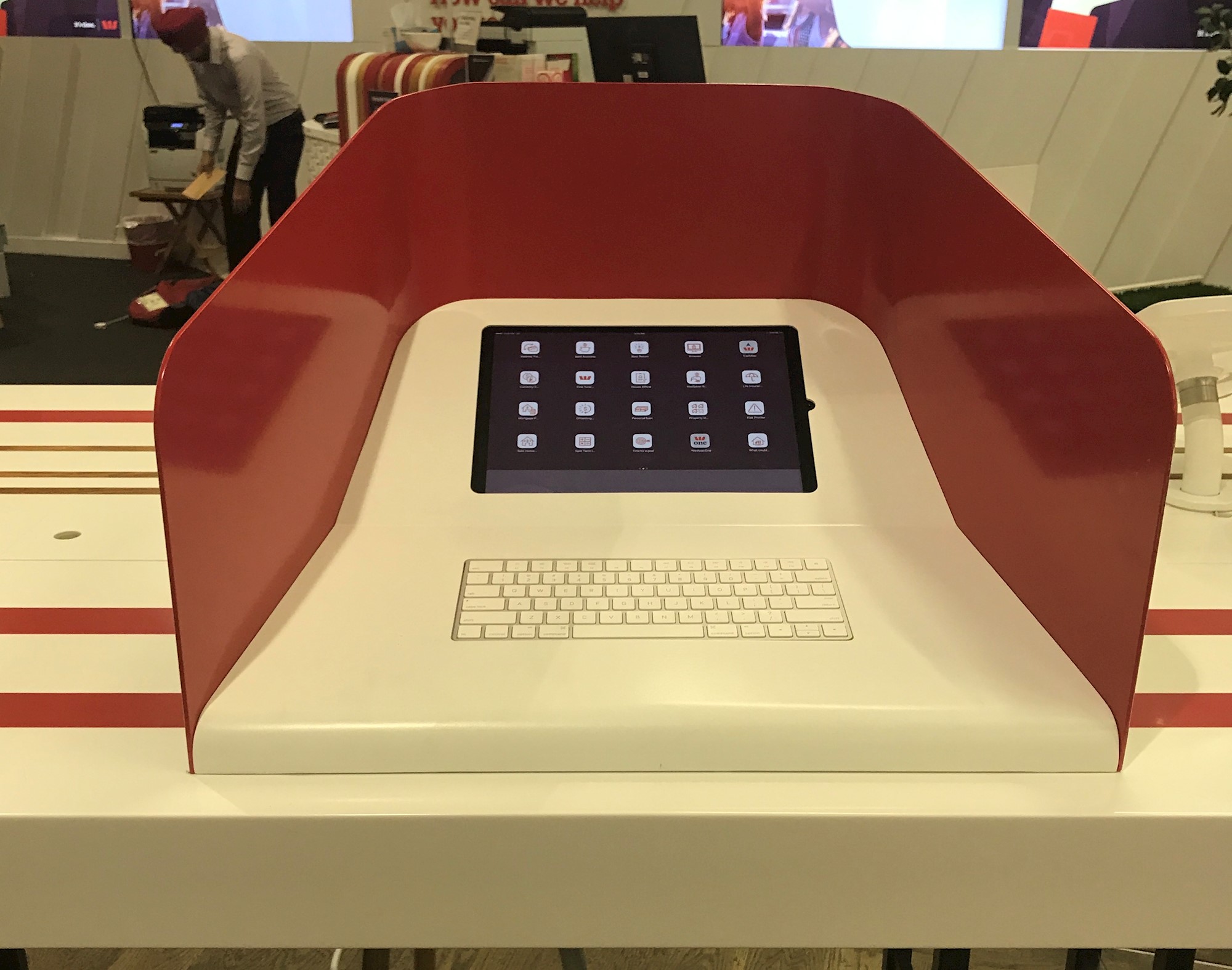
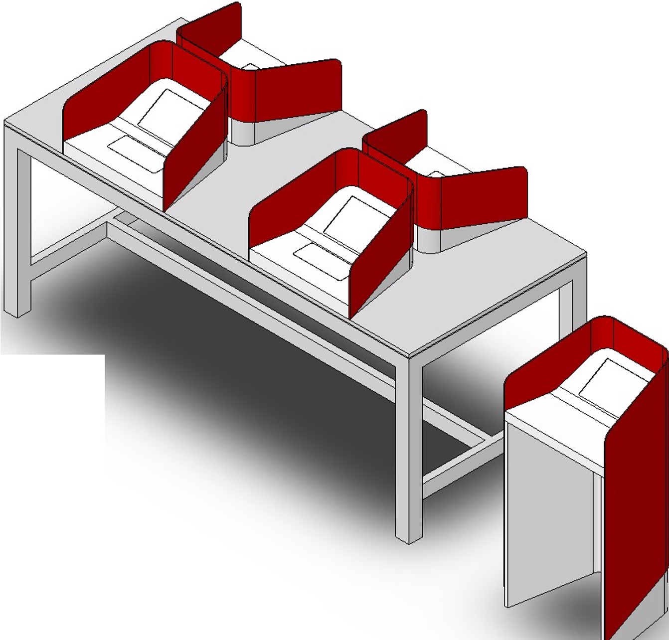
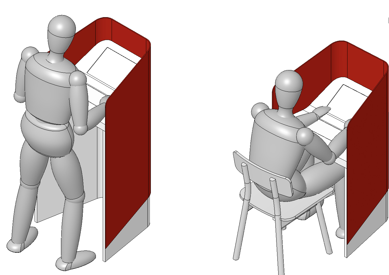
As part of their drive to improve customer service in their retail stores, Westpac wanted to give their customers better access to online banking. We produced an efficient kiosk design that could adapt to Westpac’s different retail floor plans and customer needs.
Talking about digital ideas is all well and good but if you can touch, feel it and see it, the work will proceed in leaps and bounds. That is why we make full size mock-ups wherever we can. For Westpac we made them from cardboard and very quickly found what worked for a branch and customer and what didn’t.
